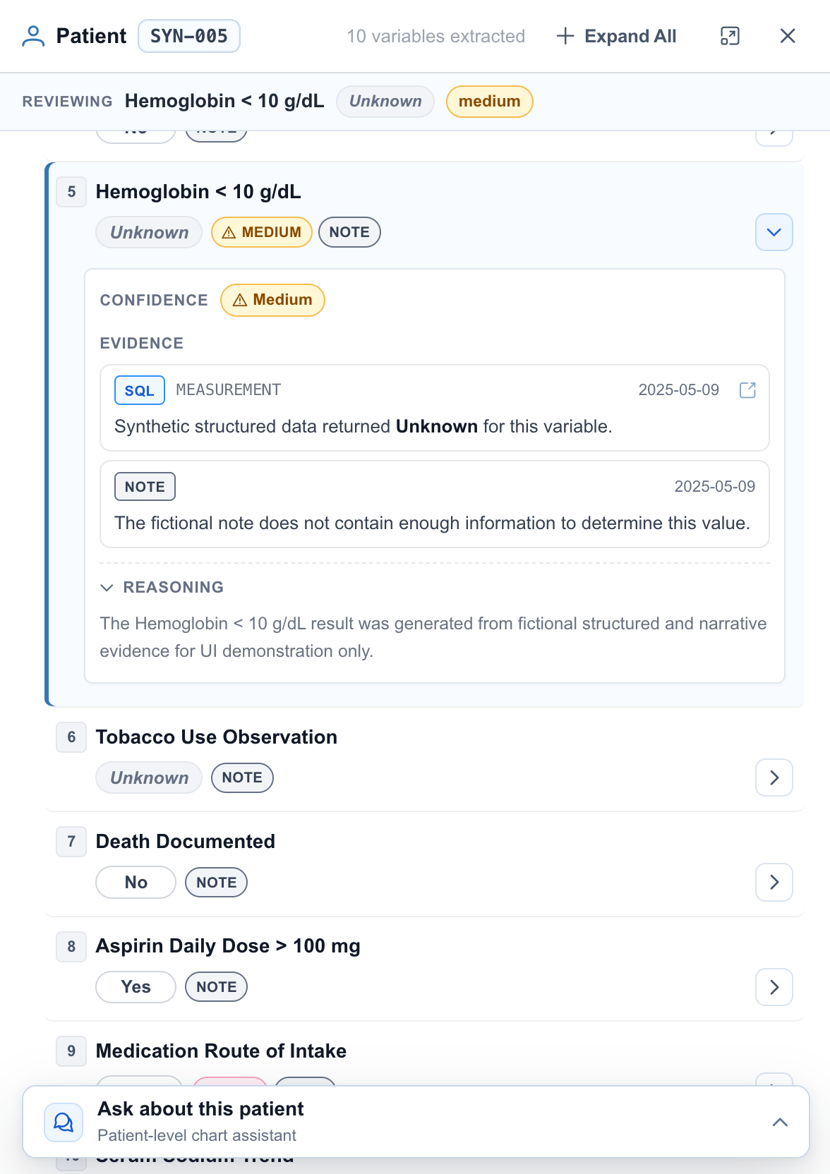
Data note: Echo is designed to work with real clinical data. The version shown in this portfolio uses synthetic data because patient information cannot be displayed publicly.
My Role
Design Engineer
UX optimization, interaction design, visual hierarchy, and Vue frontend implementation
Existing product optimization No backend or clinical data changes Implemented July 2026
Project Context
Echo’s Chart Review workspace is where clinical reviewers compare extracted answers across patients and study variables, investigate results that need attention, and inspect the evidence behind each answer.
I owned the UX optimization and Vue implementation. The mandate was to improve hierarchy and interaction without changing clinical content, extraction logic, or backend behavior.
Reviewers need to scan the cohort, identify uncertain results, and move into patient-level evidence without losing their place.
Product surfaceOne workspace, four connected views.
The variable table, patient panel, supporting evidence, and follow-up chat all contribute to the same review decision.
Delivery constraintImprove the interface, preserve the system.
The redesign had to work within existing Vue component ownership, extraction objects, and backend contracts.
Core design principleKeep the extracted answer, its confidence, and its supporting evidence connected throughout the review.
The Challenge
The problem was not missing information. It was fragmented attention.
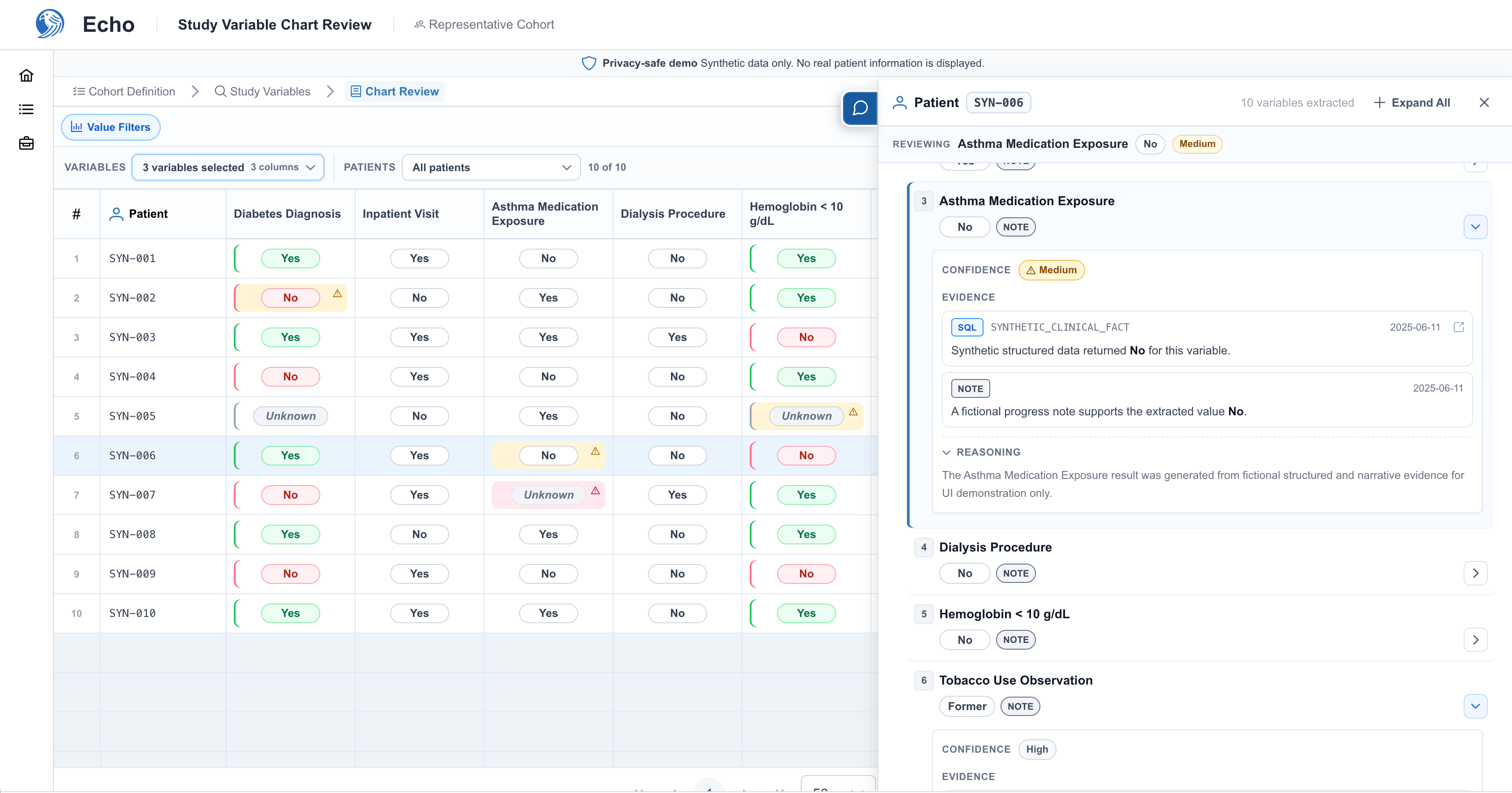
The table, patient panel, evidence, and chat each contained necessary context, but they competed for space and visual priority. Routine values looked as important as exceptions, confidence appeared only after drilling in, and opening chat obscured the evidence reviewers needed for follow-up questions.
Fig 1. Echo’s Chart Review workspace combines a patient-variable matrix with patient-level confidence, supporting evidence, reasoning, and follow-up chat.
Four breakdowns defined the redesign.
01Every value used color by defaultRoutine yes and no values appeared as prominent as results that needed closer review.→Calm the default tableUse a neutral answer treatment by default and reserve stronger signals for confidence exceptions.
02Confidence was outside the comparison viewReviewers had to open a patient's panel before they could judge how reliable a result was.→Show confidence in the tablePlace medium and low confidence indicators directly in the relevant patient-variable cells.
03Review status repeated across the patient panelAnswers, confidence, and evidence labels appeared at multiple levels, adding noise without adding context.→Create one clear detail hierarchyKeep the variable summary compact and reveal full confidence, evidence, and reasoning only in the active detail.
04Chat covered the active review surfaceOpening the assistant reduced the space available for patient variables and supporting evidence.→Keep chat non-blockingMove patient chat onto an independent layer so the active patient details and evidence remain visible.
01 · Table hierarchy
Designing the Table Language
The table needed to communicate what the extracted value was and how much attention it required without turning the grid into a heatmap. I separated answer and confidence into two default visual layers so each one had a single job.
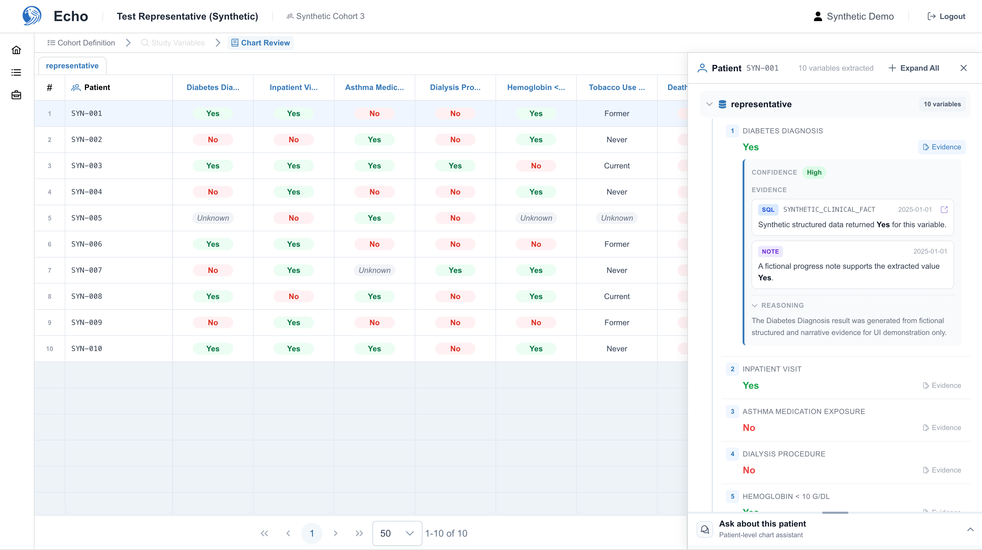
Fig 2.1. Persistent answer colors gave routine values the same visual weight as results that needed attention.
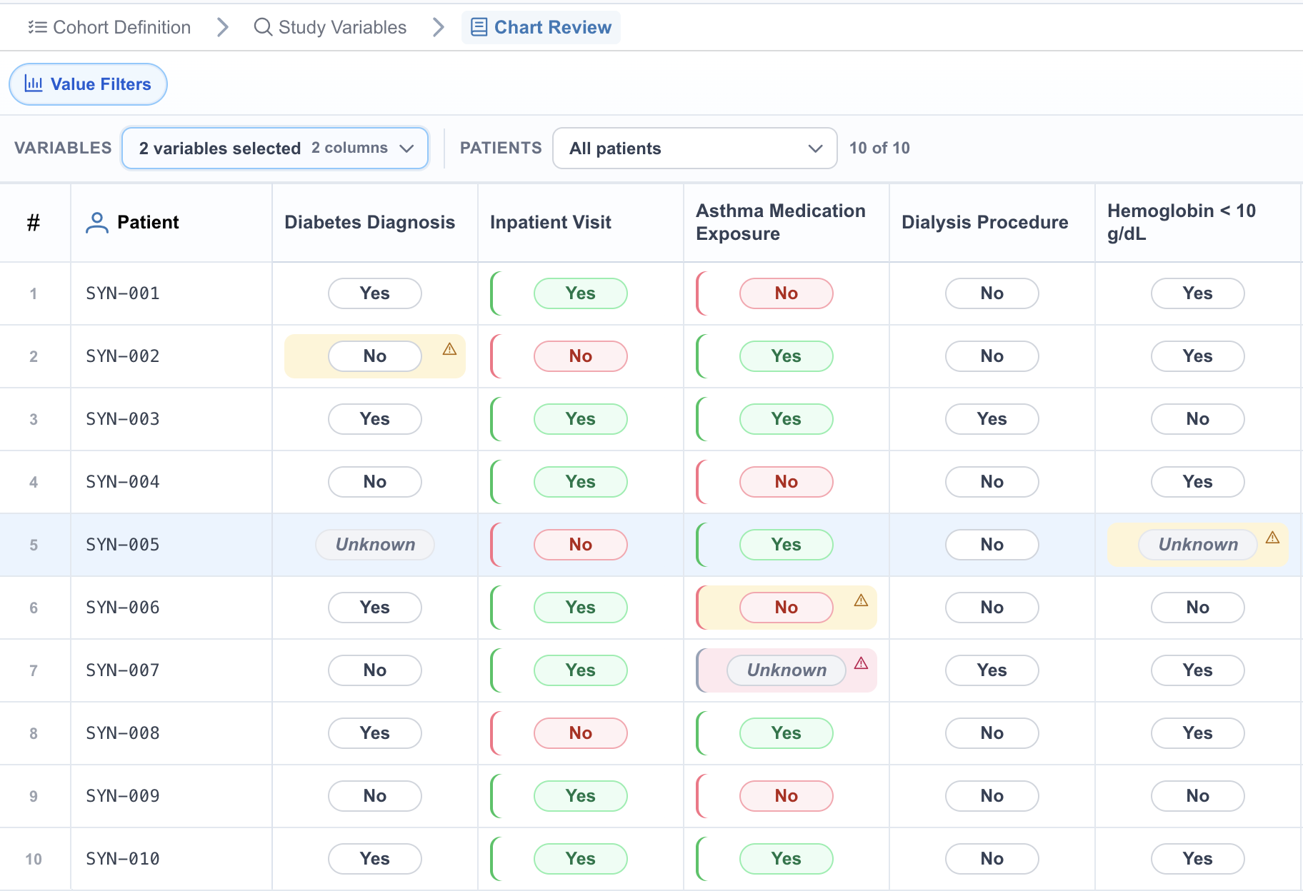
Extracted answer
The pill shows the result for one patient and study variable.
Confidence signal
A light tint and warning icon identify results that may need closer review.
Fig 2.2. Neutral values remain primary while medium and low confidence appear as cell-level exceptions.
Design Options I Tested
Each cell needed to show an extracted answer while making medium and low confidence easy to notice. I compared three treatments to find the clearest balance between value and attention signal.
01
How much emphasis should routine answers receive?
Rejected
yes
no
yes
Strong colored borders around every answer
Giving every Yes and No result a prominent border made routine values look like alerts, so exceptions no longer stood out.
Selected
yes
no
unknown
Use neutral answer pills by default
Routine values remain legible without competing with the confidence exceptions that require review.
02
How should confidence appear inside a dense table?
Rejected
no med
yes med
no low
Write MEDIUM or LOW inside every affected cell
The repeated words crowded an already dense table and slowed comparison across patients and study variables.
Selected
no
yes
unknown
Use one compact warning icon
The icon identifies an exception without adding repeated text. The legend and patient panel provide the full confidence meaning.
03
How much of the cell should confidence color occupy?
Rejected
no
unknown
yes
Fill the entire cell with confidence color
Large yellow and pink areas could be mistaken for answer state, error, or severity. Repeated exceptions also competed with the value, row selection, and hover state.
Selected
yes
no
unknown
Keep confidence color inside a restrained surface
Medium and low confidence receive a light inset tint and warning icon. High confidence stays unmarked, so the answer remains primary.
Table Refinements
Small layout adjustments made the dense table faster to scan.
180px → 140pxPatient column
Made room for more study variables while keeping patient IDs easy to locate.
Left alignedVariable headers
Created a consistent reading edge across labels of different lengths.
Stable geometryCells and indicators
Kept answer widths consistent and anchored warning icons without shifting values.
Color on Demand
Reviewers activate Value Filters only when they need to compare repeated values. Color rails appear in selected columns, while the rest of the table and confidence signals retain their default visual language.
Fig 2.3. Two selected variables use value-color rails while the remaining columns stay neutral.
02 · Patient review
Iterating on the Patient Review
The patient panel evolved through three rounds. I first reduced the original panel's deep indentation and repeated Evidence actions. That pass improved scanability, but it also exposed a new problem: the same answer, confidence, and source status could appear in the reviewing bar, the variable row, and the expanded detail at the same time. A later review with an associate research scientist also showed that patient chat still competed with the details she needed to inspect.
OriginalScattered information
Fig 3.1. Repeated Evidence controls and deep indentation made each variable slower to scan.
First revisionClearer hierarchy, repeated status
Fig 3.2. Grouping the variable state improved scanning, but the same information appeared up to three times within one view.
Latest revision
Protect the patient detail while keeping chat close
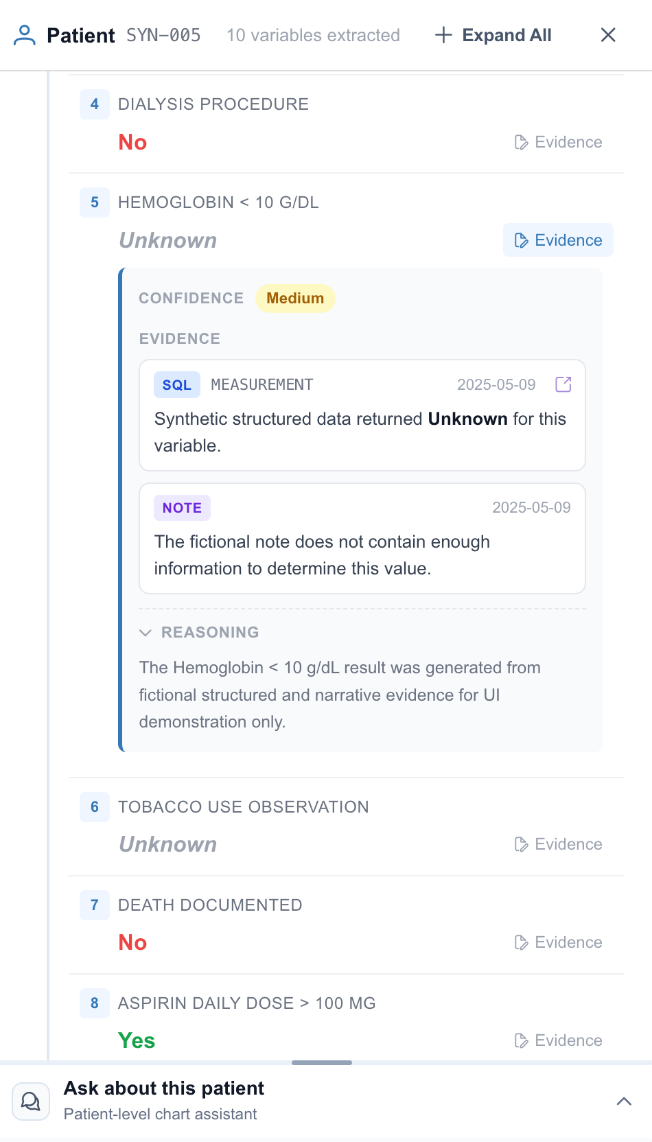
In the next pass, I removed confidence from the variable-row summary and let the expanded detail carry the evidence-specific confidence state. The row remains a compact index of the extracted answer and available source type, while the reviewing bar preserves the active context.
An associate research scientist then pointed out that the chatbot still blocked too much of the patient detail. That feedback changed the layout decision: chat needed to be spatially independent, not another region inside the review panel.
The final design attaches chat to the left edge of the patient panel as a resizable companion layer. It expands over the lower-priority table—not the patient detail or evidence—so reviewers can ask questions and inspect the supporting record at the same time.
Final revisionIndependent but connected
Fig 3.3. The resizable chat layer grows over the table while patient details remain fixed and readable.
03 · Value filtering
Value Filters
Extracted answers may be binary, categorical, numeric, or free-form, so permanent value colors would not scale. Value Filters is an optional analysis mode: reviewers choose the variables and patients they want to compare, and only the selected columns receive stable value-color rails. Confidence remains a separate signal throughout.
Fig 4. Three selected variables receive value-color rails; unselected columns stay neutral, and confidence warnings retain their own visual treatment.
01
Select Variables
Choose one variable for distribution detail or several for comparison.
02
Compare Values
Stable color rails group repeated values only in the selected columns.
03
Narrow Patients
Optionally select a patient subset without losing the variable comparison.
Rules That Keep the Table Legible
One variable
Distribution chips appear for that column and can filter rows by answer value.
Multiple variables
Selected columns receive stable value rails, but no cross-column value filter.
Confidence remains separate
Medium and low confidence retain their tint and warning icon in every mode.
Implementation and QA
I implemented the redesign in the existing Vue frontend without changing clinical content, backend contracts, or component ownership. The work stayed focused on presentation, layout, and interaction behavior.
Frontend implementation
Updated ChartReviewView, ChartReviewResultPanel, EvidenceDetail, and PatientChatDrawer instead of creating a parallel interface.
Moved patient chat from a vertical splitter into a resizable companion layer attached to the patient panel while preserving its existing props and events.
Kept value filtering and confidence treatment in the presentation layer so the same extraction objects drive the redesigned states.
Interaction QA
Tested single, multiple, and all-variable states together with patient subsets and combined filters.
Found and fixed an overlap bug that made visible value chips unreliable to click.
Corrected the reset logic so any active variable, value, or patient filter enables Clear.
Checked contrast across answers, confidence, source labels, and chat, then strengthened labels and warning tints that were too faint.
Building a Privacy-Safe Portfolio Demo
A public demo required more than replacing patient IDs: dates, note references, evidence, reasoning, and structured results could still reveal sensitive information. I created a dedicated route with deterministic synthetic data and a separate portfolio build that excludes the local real-data snapshot and never calls the backend.
Data isolation: every patient, value, date, note, SQL result, evidence sentence, and explanation is fictional.
Repeatable review: query-based scenes reopen the same table, filter, evidence, and chat states for consistent captures.
Result
The final interface reduces persistent answer color, surfaces medium and low confidence as exceptions, keeps patient evidence visible when chat opens, and adds optional value comparison without changing clinical content or backend behavior.
Calmer default table. Neutral answers support binary and non-binary values; color appears only during comparison.
Confidence in context. Medium and low results remain visible as exceptions without turning the grid into a heatmap.
Protected evidence. Resizable patient chat expands over the table while the active detail panel stays fixed.
Production constraints preserved. The redesign uses the existing Vue components, extraction objects, and backend contracts.
Reflection
Protect the reviewer’s attention.
This work was less about adding features than making the existing workflow more trustworthy. Every design decision had to support a clear path from result to evidence.
01What was extracted?Keep the answer primary.
02How reliable is it?Surface confidence as an exception.
03What supports it?Keep evidence visible and uninterrupted.
Anything that did not support that review path was reduced, neutralized, or moved out of the way.