aitcc.ai: Brand, Website, and Design System
The AITC program's brand and public website, which I designed from scratch and built on my own, and the system that keeps them running: a design system the build enforces, and workflows that automate what staff used to do by hand.
Project overview
The problem
Five collaboratories and a coordinating center needed one identity and one public home for funding calls, events, and funded projects.
My approach
Design the site from scratch around what researchers need during a funding cycle, and write down every rule as it settled.
The result
A brand staff can use without a designer, a site and print RFA that match, and a design system checked on every build.
Everything someone needs, on one page.
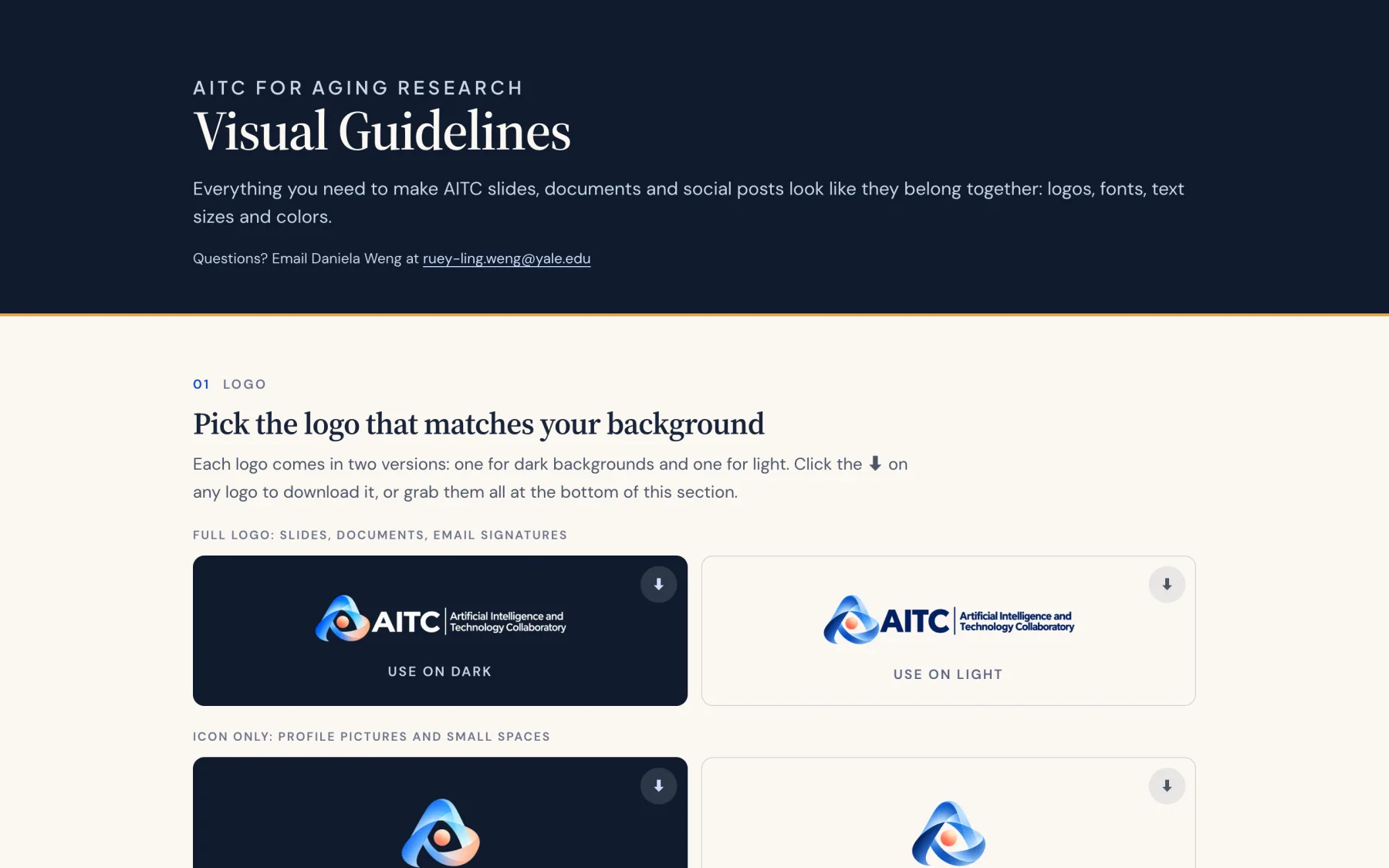
The people making AITC slides and flyers are program coordinators at different universities, most of whom never open a design tool. Instead of a brand book, they get one page on the site: pick the logo that matches your background and download it, then the typefaces, a type scale for slides and documents, and the color palette with the text colors that pass contrast on each.
The values come from the website's own tokens. When a token changes, the guidelines change with it, so the page and the site never drift into two brands.
- Logos by use
- Full lockups for slides and documents, an icon for profile pictures and small spaces, each for dark and for light, plus social avatars and favicons.
- Two voices for text
- Source Serif 4 for headings and DM Sans for reading text, the same pairing the website and the grant platform use.
Make the next event the first thing you see.
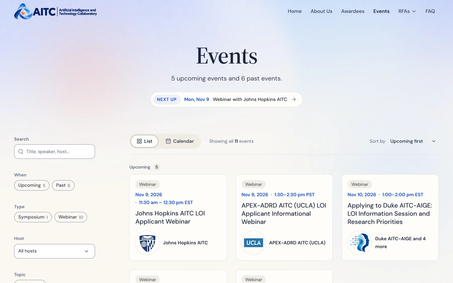
The events page opens on a centered banner in its own blue palette with a single coral glow, and one line under the title links to the soonest event.
Below it, events fall into Upcoming and Past, with the List and Calendar switch on the same row as the count and sort. Each event page carries Register, Add to calendar, and the flyer, plus the recording once the talk is over.
One path for every AITC's events.
Six AITCs run webinars, workshops, and symposia, and each sent details by email in its own format, which I then posted by hand. I am automating the path from an organizer's details to a live event, one piece at a time.
- One file per event
- An event is one MDX file. It feeds the homepage, the events list, its own page, and the calendar download, so the four can never disagree.
- Upcoming is computed, never typed
- Events have no status field. Each one's own time zone decides when it has passed, and a nightly rebuild moves it from Upcoming to Past.
- Drafts and recordings
- An event can wait as a draft until the RFA it links to goes live. Afterwards the recording is embedded on its page, with a thumbnail from a shared template.
- Next: one form for every AITC
- Organizers will send everything through one form instead of email. I designed it and its flow, and it is in review now.
Designing the submission form
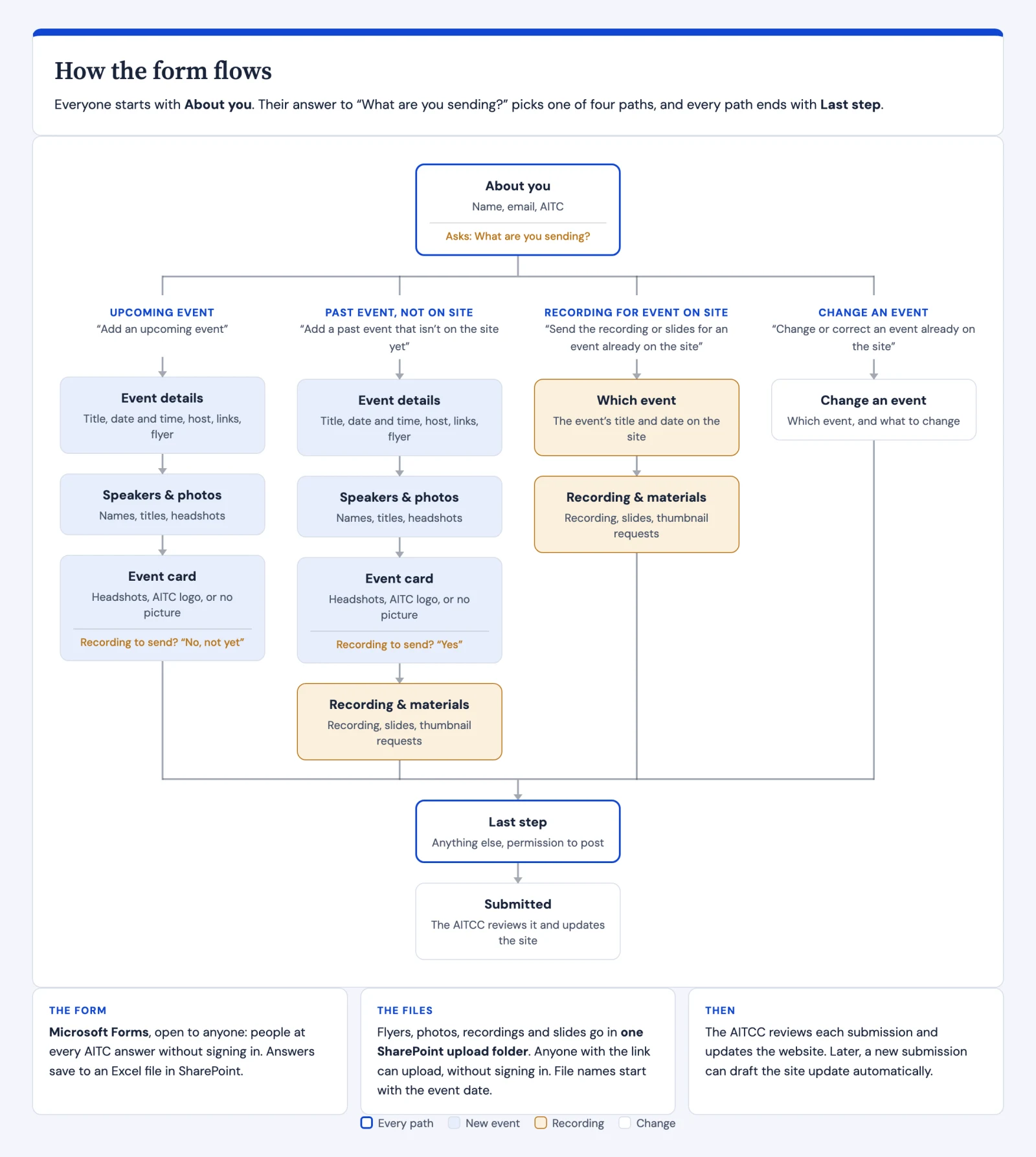
The first question, "What are you sending?", splits the form into four paths: an upcoming event, a past event not on the site, a recording for an event already there, or a correction. Each path asks only for what that case needs, and all four end at the same last step.
The people filling it in work at Duke, Johns Hopkins, Stanford, UCLA, and beyond, not only Yale. So the answers go through Microsoft Forms, open to anyone without signing in, and flyers, headshots, and recordings go to one SharePoint upload folder, named by event date. Every "Other" choice has its own text box, so no answer is lost.
Once it is live, the next step is for each submission to draft the site's event file on its own.
One funding call, in print and on the web, word for word.
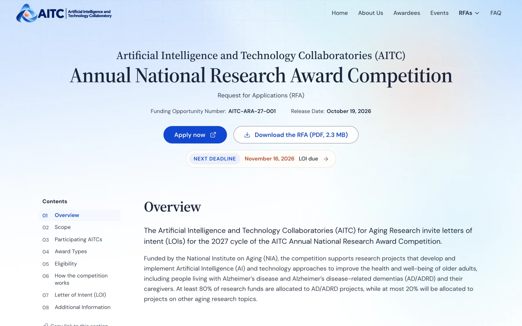
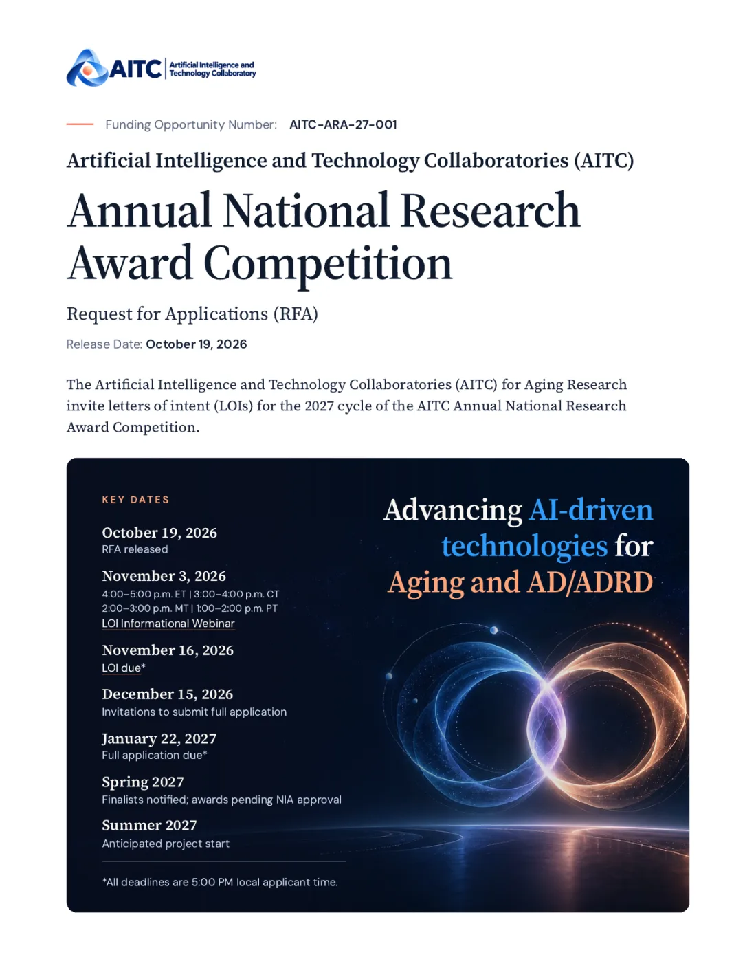
The request for applications for the 2027 AITC Annual National Research Award Competition is the document every applicant starts from. I designed it first as a 16-page print PDF, built from HTML and CSS so the text, footers, and page numbers are generated rather than laid out by hand, and revised it through the program manager's review.
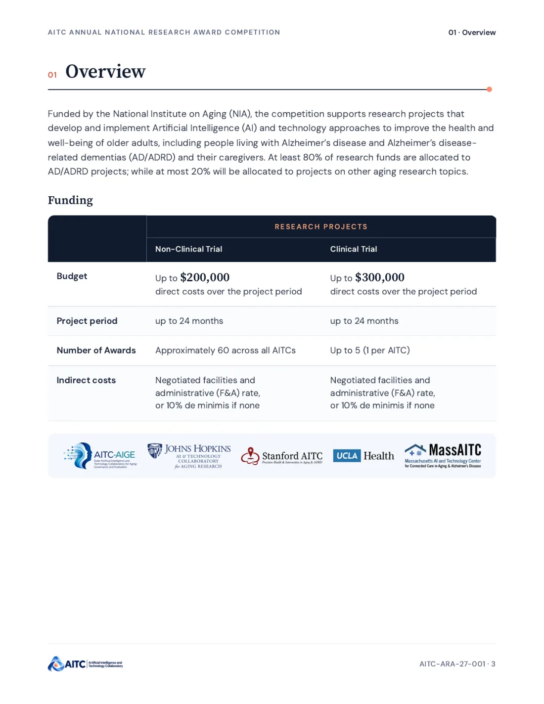
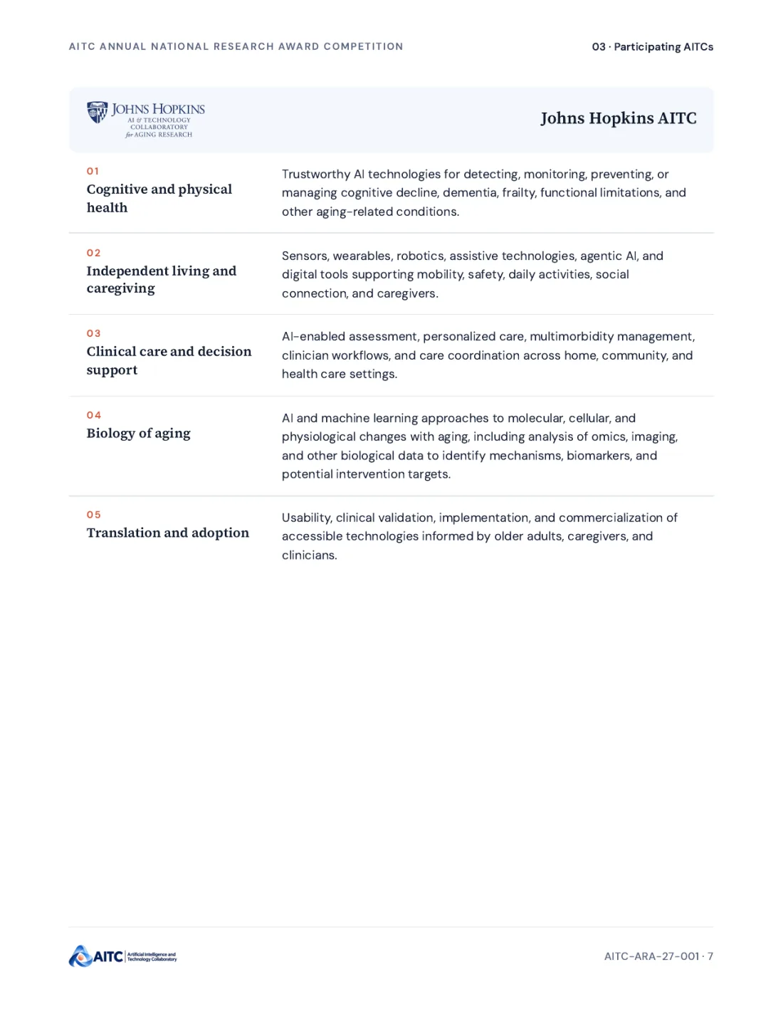
The cover carries the key dates. Funding is one table comparing the two award types. Each participating AITC gets a page with its research areas, so an applicant can choose a program before they write a word.
On the web
The RFA page follows the same structure, styled as a website rather than a printed page: white ground, serif headings without rules, and one boxed call to action.
Because it is a funding announcement, no wording could be lost. A script compares the PDF's text with the page: 243 of 244 passages match, and the one gap is a slogan removed on purpose. Placeholders still waiting on the program show as "To be confirmed".
- Contents that follow you
- A contents rail beside the text highlights the section on screen. On a phone it becomes a sticky bar naming the current section.
- Deadlines up front
- A "Next deadline" chip in the banner links to that date in a vertical key-dates timeline, and the row flashes when you arrive.
- Sharing a section
- One "Copy link to this section" button. Links to other sites open in a new tab and say so to screen readers.
- The next RFA is one file
- The body is written with fourteen components, so a new funding call is a single MDX file instead of a new page.
Search first, and one way to reach each section.
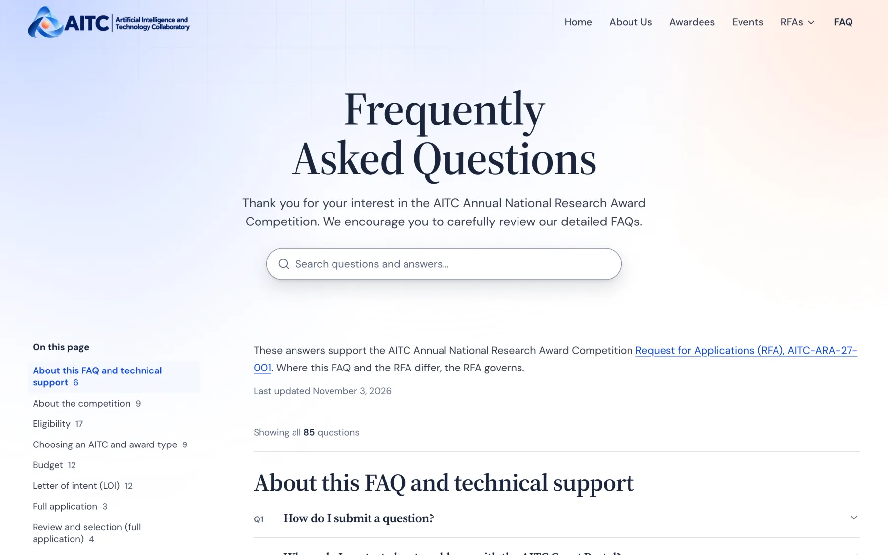
Search sits in the hero, centered under the welcome, with the result count beneath it. Matches are highlighted in the answers, and when nothing matches the page offers to take the question.
A single contents list leads to each section. Every open answer has its own copy-link button, so staff can point applicants to an exact question.
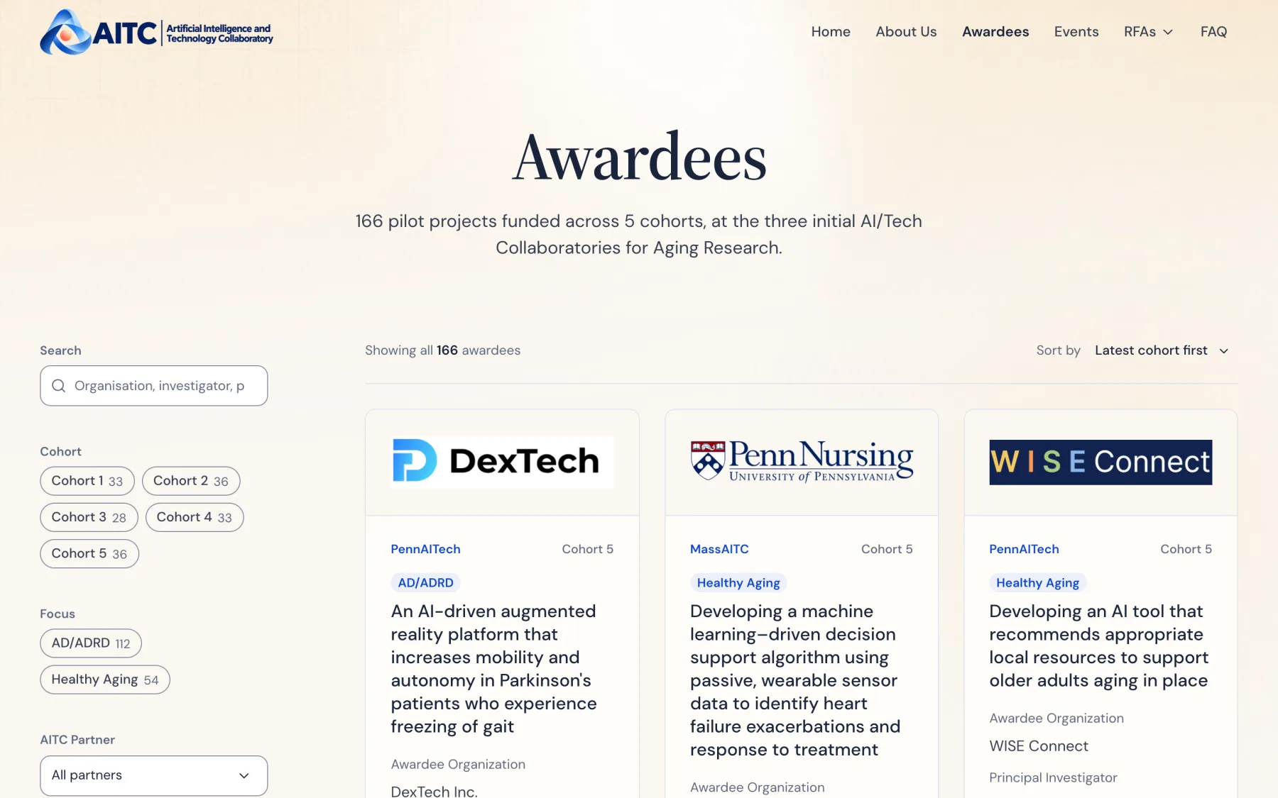
Quiet cards for 166 funded projects.
The page opens on the light banner the other listings use, in its own champagne palette, chosen from a side-by-side of three.
On the cards, the research focus is one small badge above the title, the remaining tags are a single line of muted text, labels are in sentence case, and short images leave room for the project description.
Small pieces that show up every week.
Most people meet AITC in a webinar. Zoom backgrounds put the logo in the upper left and keep the center of the frame clear for the speaker, with the ribbon from the logo only along the bottom edge.
A YouTube thumbnail template turns each recorded talk into a consistent series card. Organizers only send a speaker photo, and the recording lands on the event page with its thumbnail.

Write the rules down, then let the build hold them.
Each page settled a decision the next one needed. I wrote them into the site's DESIGN.md as one compact system (principles, three color tiers, type roles, layout, buttons, hover and press, icons, components) and added a style overview page that shows them in use.
As the site grew I folded every one-off value back into the scales, and extended the build check so any color, breakpoint, or duration outside them fails the build.
Every color has a measured contrast ratio, and every change is checked at 1440px and 390px before review.
What I learned
A brand for a consortium is used mostly by people who will never open a design tool. The guidelines worked once they answered the question people actually had, which logo do I use here, before anything else.
On a site many people send content to, a design decision only lasts as long as someone remembers it. Writing each one down with its reason, and making the build check the ones a machine can check, is what kept the site from drifting.
The event workflow taught the same lesson for content: when the date decides what is upcoming, and one form decides what an organizer sends, nobody has to remember the rules.