AITC Grant Platform
The platform that runs AITC's funding competitions: publishing a request for applications, collecting letters of intent, reviewing them, and releasing decisions across five collaborating programs.
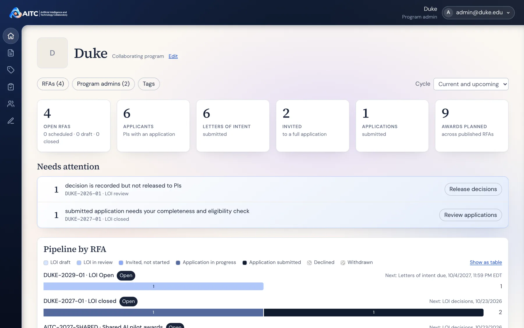
All screenshots use demo data: sample programs, people, and projects.
Project overview
The problem
One national competition, offered by five programs, each reviewing its own letters of intent on its own schedule.
My approach
Design each role's view around the one next thing that person has to do, then test it as that person.
The result
Four role-specific workspaces over one pipeline, refined from usability review and documented step by step.
One competition, many hands.
The AITC Annual National Research Award is published once by the Coordinating Center but offered by every collaborating program. A researcher picks a program when they start a letter of intent, that program asks reviewers and records a decision, and only invited researchers go on to a full application.
So the same application passes through four kinds of people who never see the same screen. A principal investigator may use the platform once a year. A program admin may be tracking dozens of applications across several RFAs at once.
- System admin
- The Coordinating Center. Adds programs, builds and publishes RFAs and their forms, and can see every program.
- Program admin
- Staff at a collaborating program. Asks reviewers, records decisions, checks full applications, and releases results to applicants.
- Principal investigator
- Browses funding opportunities, submits a letter of intent and, if invited, a full application.
- Reviewer
- Accepts or declines review requests and submits reviews. Reviewing is a section added to any account, not a separate login.
Every screen leads with what that person has to do next.
Each role lands on a different home, but the pattern holds: what needs attention first, the current step in plain words, and the action that moves it forward.
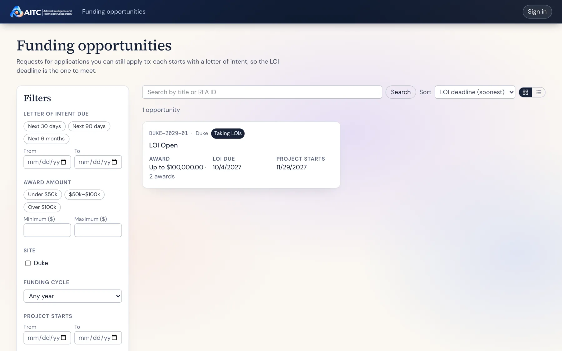
Open with the deadline that matters.
Every RFA starts with a letter of intent, so opportunities sort by LOI deadline and each card shows the award, the due date, and which programs offer it.
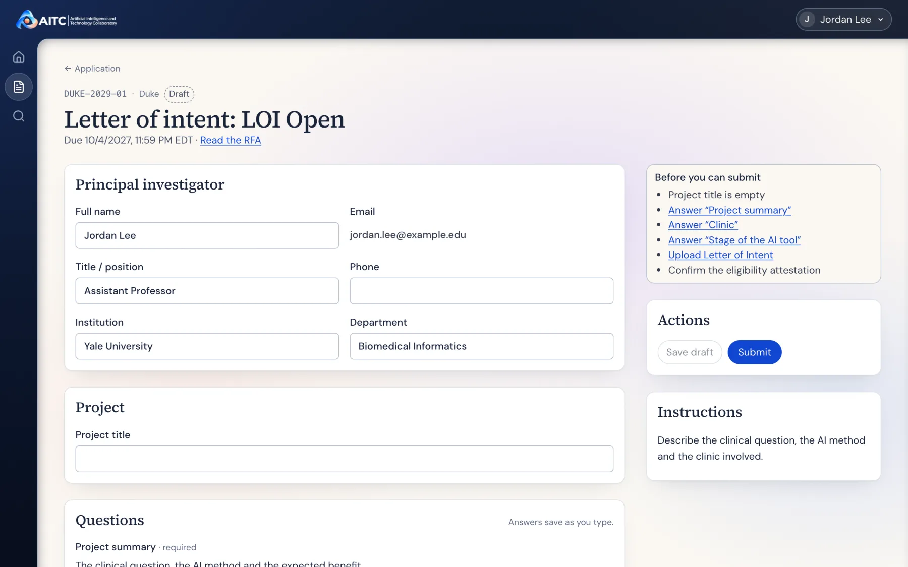
Say exactly what is missing.
A "Before you can submit" checklist links to each unanswered question. Answers save as you type, so a PI can stop and come back before the deadline.
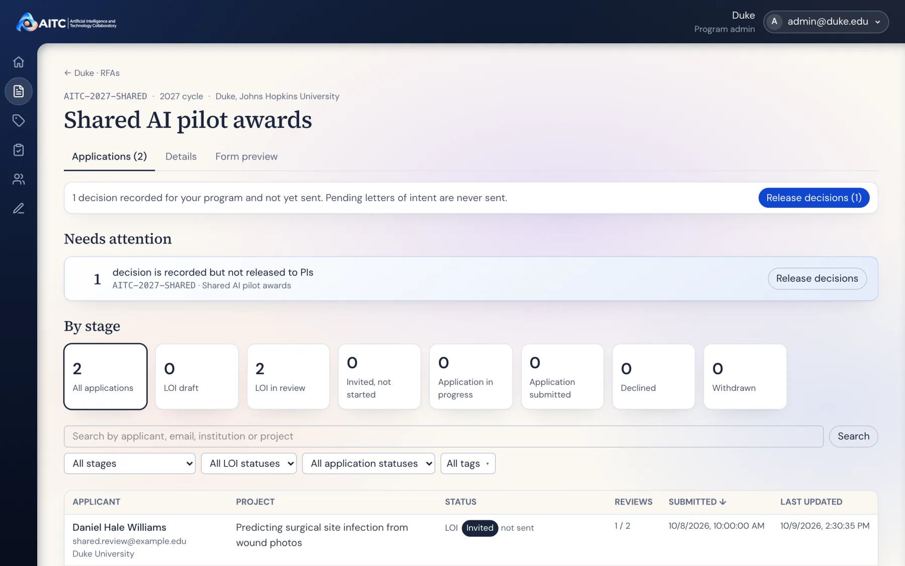
Show the pipeline, then what is stuck.
Applications group by stage, and anything waiting on the admin, like a decision recorded but not yet sent, rises to the top with its action beside it.
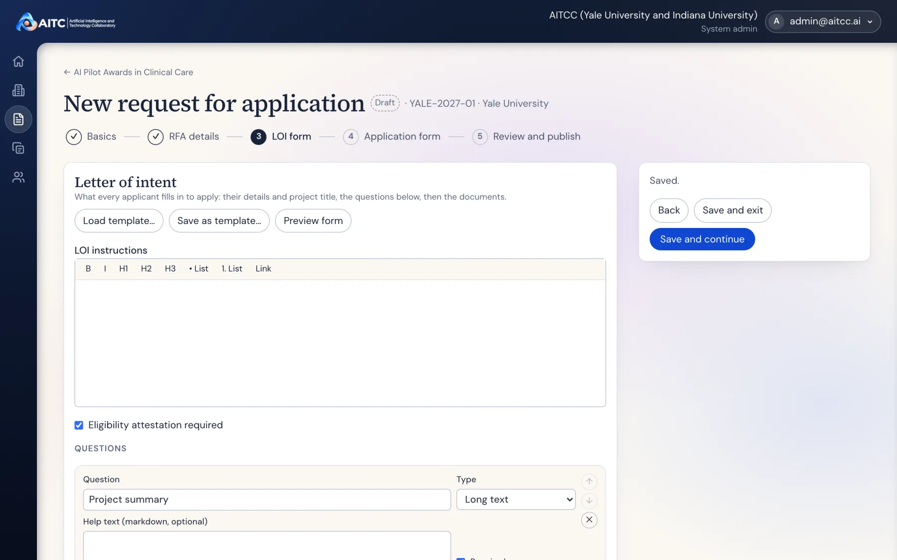
Build an RFA in five steps.
Basics, details, LOI form, application form, then review and publish. Forms can start from a template and be previewed as an applicant sees them. Nothing is public until it is published.
Reviewing stays small.
Reviewers fit this in around their own work. Their form is one recommendation and an optional comment, saved as a draft as they type, beside the letter of intent they are reading.
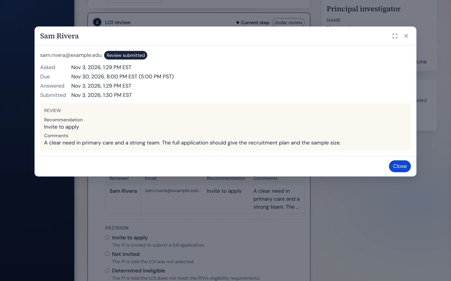
Testing as an applicant and a reviewer.
Before launch I walked through the staging platform as a principal investigator and as a reviewer and filed what got in their way. Most of it came down to things people could not see or could not find. Every item was fixed in one round and checked at four screen widths.
- The submit checklist got covered
- The status card slid over "Before you can submit" while scrolling. The whole right column is now one sticky block that scrolls on its own.
- Errors did not look like errors
- A new danger color, red borders and messages, and
aria-invalidon fields, so problems read the same to eyes and to screen readers. - Small, grey text
- Body text went up to 16px and secondary text to 14px, with a 12px floor. Sign in became a solid, high-contrast button.
- Icons without names
- The side rail shows page names beside the icons from 1024px up, and Reviewing shows how many reviews are waiting.
- The wrong headline
- A PI's application page now leads with their project title, with the RFA title underneath.
- Forms that rejected normal input
- The budget field accepts "$75,000" as typed, and search takes its own row on narrow screens instead of breaking.
Guides that are rebuilt, not rewritten.
I wrote a user manual covering every role, a short guide for PIs on submitting a letter of intent, and a guide for program admins on managing them. Each step pairs one instruction with a screenshot, and numbered red markers show exactly what to click.
The screenshots are taken by scripts that sign in as each role on a local copy of the platform filled with demo data. When the interface changes, the guides are regenerated in minutes instead of being re-captured by hand.
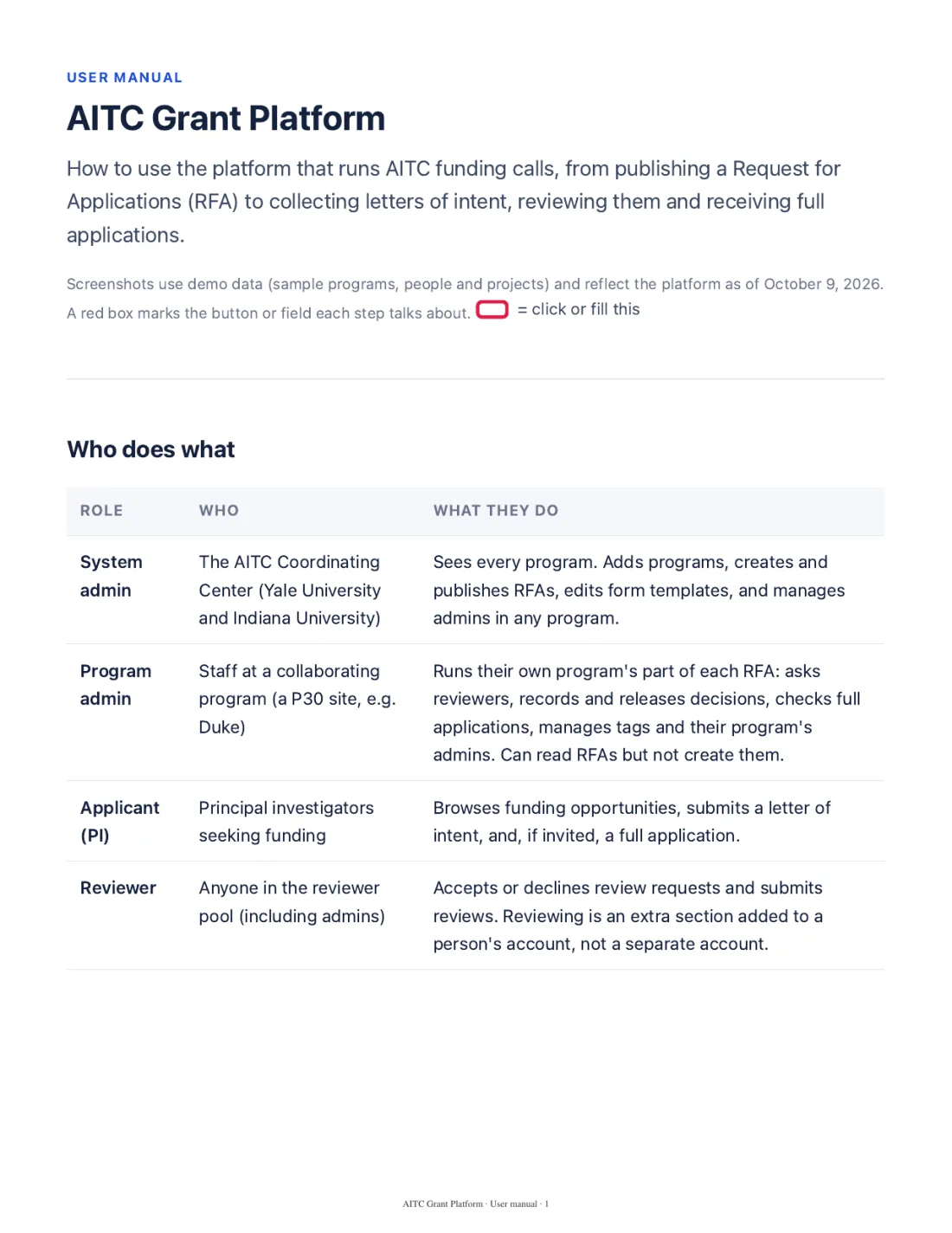
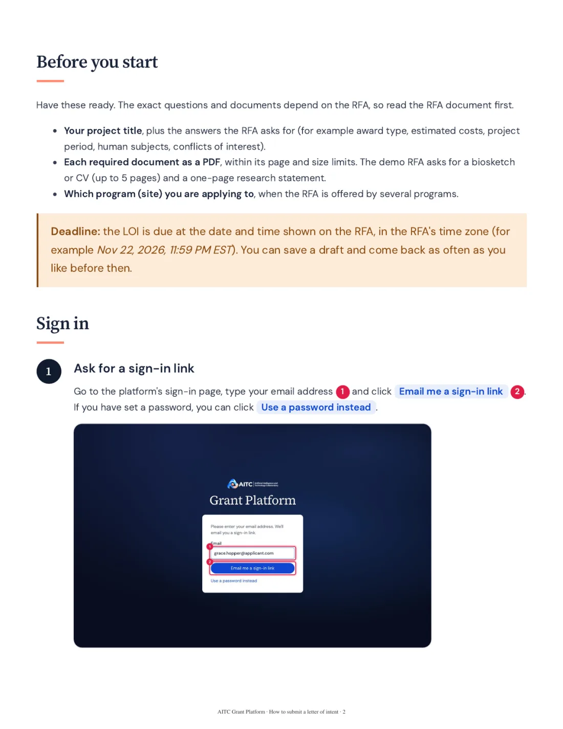
The user manual runs 76 pages; the PI guide is 16. Both are published as web pages and PDFs.
What I learned
A platform with four roles is really four products sharing a database. The most useful thing I could do was use each one as that person would, on a real screen size, with a real deadline in mind.
Writing the manual turned out to be a design review of its own. Any step that took a paragraph to explain was a step worth simplifying in the interface.